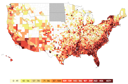
This map shows the rate of persons living with an HIV or AIDS diagnosis, 2012.
For the interactive version, visit aidsvu.org/map.
AIDSVu launched new interactive maps of HIV prevalence data for the 34 U.S. cities most affected by the epidemic, including state and county data and year-by-year diagnosis information for 2008 to 2013.
A project of Emory University’s Rollins School of Public Health, along with Gilead Sciences, the AIDSVu maps can filter data not only according to geography, but also by demographics such as age, race and mode of HIV transmission. Social determinants of health—such as education, poverty and health insurance—are also included.
The national map, using data from 2012 (one of the most recent years available), shows that the number of people diagnosed with HIV was highest in the South (22,629) and the Northeast (8,629).
“We are constantly expanding AIDSVu as a resource for people who work in HIV policy and care, because this tool is critical in helping to identify areas in the U.S. with the greatest need for resources,” Patrick S. Sullivan, PhD, DVM, the principal researcher for AIDSVu, said in a press release. “AIDSVu provides a road map for the state of the HIV epidemic, from the national level all the way down to neighborhoods. By utilizing these data and visuals, our researchers, doctors, and communities can pin-point where prevention and treatment activities are most needed to make real change and stop the spread of HIV.”
Click on These Interactive Maps to See the Latest HIV Data


Comments
Comments